Remote Technician Service Flow
Company
HomeX
Tools
Figma
Duration
2 Months
My Role
Product Designer
UX Researcher
Introduction
Overview:
Direct Remote Assist, or Direct RA, is a product for customers to get help from technicians remotely for their home issues on HomeX website.
Problem Statement:
The purpose of this project is to find out users’ preferences for how they get connected to technicians and iterate the current design based on user feedback. The goal is to increase completion rate and reduce drop-off rate in the Direct RA connection process.
Users:
Homeowners in the U.S. and Canada.
My Role:
I collaborated with design manager to define goals, conduct user testing, and iterate design.
Constraints:
The project is a one-month capstone project during my internship. The project was still going on after I completed my internship.
Discover
I started the project with looking into existing flow and user data tracking.
Current Flow
No matter how users reached our website, they will have to go through these 5 pages before they speak to technicians.
Define Probelms
For users who started the flow on the website, only less than 3% of them eventually booked or started a session. The problem we are facing here is the high drop-off rate especially in “select trade” and “sign in” pages.
Where and why do users drop off?
How to increase the completion rate of Direct Remote Assist flow?
Direct Remote Assist Funnel Data 07/01/2021 - 08/13/2021
Define Goals
Find out the reasons for why users dropped off at each step
Improve user experience in the flow to decrease the drop-off rate
Define Metrics
Completion rate of the funnel
Drop-off rate of each step
Diverge
Brainstorm Design Ideas
To figure out why users drop off at each step, I made some assumptions for potential reasons based on previous research. In order to mitigate the confusion and frustration in the flow, I brainstormed multiple design variants for each step, which can potentially improve the experience.
Why do users drop off at “Trade Selection“ step?
Potential Reasons:
Don’t know which trade to select.
Don’t consider their issues belong to any provided trades.
They are not committed users and this step is different from what they expected.
How might we help users complete trade selection easily?
Why do users drop off at “User Information Collection“ step?
Potential Reasons:
Prefer to continue as a guest.
Not the right time to ask users to sign up before their issues are solved.
How might we integrate the “User Information Collection” step frictionlessly?
Converge
It’s easy to become over-confident in our own design ideas. Rigorous testing and iteration can help challenge our assumptions and bring clarity.
User Testing on Ideas
How do we know which variant will work and actually decrease the drop off rate?
One way to do it is to update the features with the ones that we think would work best, track the data and compare with the current flow. However it would take a lot of time and resources for development and data analysis. Therefore, I went with a more time efficient method, Preference Testing.
Testing Methods
Besides the preference testing, I also asked the participants to try out the current RA flow on the website and give feedback as they complete each step.
Participants
Participant Requirements:
People who have not used HomeX Direct Remote Assist before
Internal employees who do not work on HomeX consumer website
Recruiting Channels:
Company Slack channels
Social media platform: Nextdoor, Facebook, Reddit
Number of Participants:
As found in a study, 5 participants could find 85% of the usability problems. Eight participants should be a good starting point to test the design ideas.
Affinity Mapping
I organized the qualitative data from the user testing into an affinity map to categorize user’s feedback.
Rating Results for Design Ideas
1: extremely difficult, no willingness to continue and will drop off;
10: extremely easy, definitely will complete and continue.
Testing Results for “Trade Selection”
Testing Results for “User Information Collection”
Insights & Solutions
Insights:
Unexpected next steps and lack of context: During the test, I always asked participants what are their expectations for the next step, and they never got it right.
Need reasons behind each steps: Users expect reasons for why they have to complete certain tasks, for example, why need to select the trade, why they need to provide their information, etc.
Varied knowledge & confidence level: the amount of knowledge people have about home issues varies greatly.
Solutions:
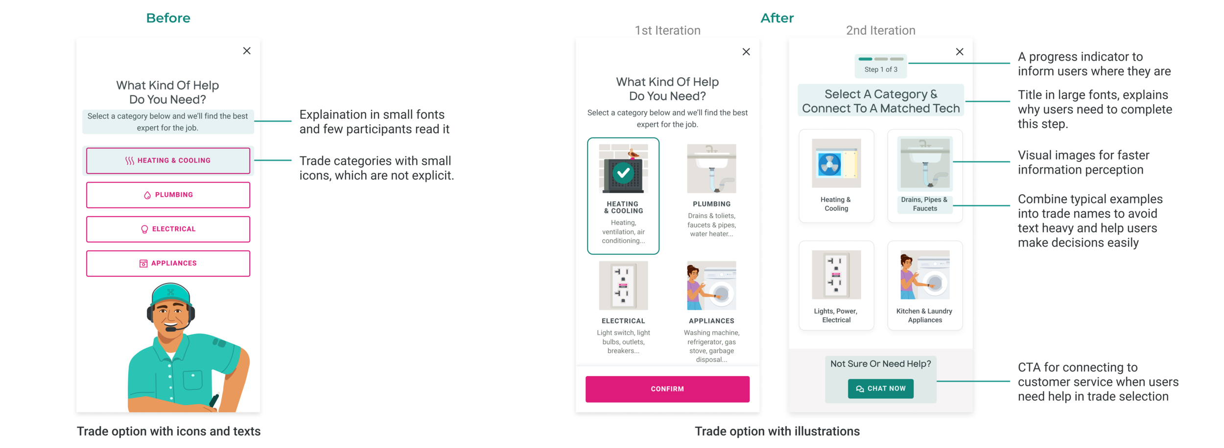
An overview and progress indicators for each step: It would be helpful for them to have a sense of context by providing an overview and progress indicators at each step.
Give clear and strong reasons for why each step is necessary: It might be helpful to give them clear and strong reasons for each step. This need to be presented in a clear and concise manner as I also found that they don’t read the secondary small texts on the screens.
Further research on target users: We really need to do more research about our target audience for this feature.
Iteration
Design Iteration for “Trade Selection“
Design Iteration for “User Information Collection“
Takeaways
Start planning early: Start user testing planning and participant recruitment as soon as possible
Importance of verifying assumptions: Some design decisions are based on our assumptions for users with the best judgement of the information we had at that time. It’s important to verify the assumptions.
Value of user testing:
Get design ideas tested to narrow down options before spending too much time on improving design details
No extra dev effort needed


